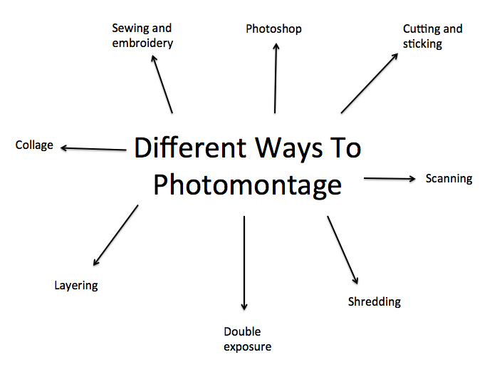
MOOD BOARD AND INSPIRATION

MOODBOARD

Here are some of my favourite images that I have found on Pinterest that have given me inspiration towards my own ideas.


HOW TO PRODUCE A PHOTOMONTAGE:

Screen Shot 2017-05-16 at 15.13.44


Featured post

ALEX RODCHENKO – ARTIST RESEARCH

Alex Rodchenko was one of the most versatile constructivist and productivist artists to emerge after the Russian Revolution. He worked as a painter and graphic designer before turning to photomontage and photography. His photography was socially engaged, formally innovative, and opposed to a painterly aesthetic. Concerned with the need for documentary photo series, he often shot his subjects from odd angles—usually high above or down below—to shock the viewer and to postpone recognition. He wrote:

“One has to take several different shots of a subject, from different points of view and in different situations, as if one examined it in the round rather than looked through the same key-hole again and again.”

Here are some of Alex Rodchenkos photomontages.

By looking at this image above you are able to assemble the planes and the planet in the image to the idea of World War 1 that was happening at the time this photomontage was created. I also think the mans expressions sets a mood for the image that perhaps this period Rochenko was living in wasn’t the happiest. Adding to the idea of war, I think the use of block colours represents a divide in the war.

HANNAH HOCH – ARTIST RESEARCH

HANNAH HOCH – THE NEW WOMAN

Hannah Höch (November 1, 1889 – May 31, 1978) was a German dada artist. She is best known for her work of the weimar period, when she was one of the originators of photomontage.

The Weimar Republic is an unofficial, historical designation for the German state between 1919 and 1939. The name derivers from the city of Weimar, where its constitutional assembly first took place. After Germany lost the first world war, the kaiser fled and a new democratic government of Germany was declared in February 1919 at the small town of weimar. It was too dangerous to make a declaration in berlin where there had just been a revolt by a communist group called the Spartactists. The weimar republic was a genuine attempt to create a perfect democratic country.

Höch’s work was intended to dismantle the fable and dichotomy that existed in the concept of the “New Woman”: an energetic, professional, and androgynous woman, who is ready to take her place as man’s equal. Her interest in the topic was in how the dichotomy was structured, as well as in who structures social roles.

3024729-poster-p-hannah-hoch-modenschau-014

As you can see from her work above, her work represents how she feels society and males view the perfect woman. I feel with each piece of media and material she has used to collage, represents a different element of being a woman in the 1900s. For example, the use of the dolls head represents the pressure of appearance, the use of the saddened woman represents the house wife and the skull represents the anger Hoch and many other woman were feeling.

Other key themes in Höch’s works were androgyny, political views, and shifting gender roles. These themes all interacted to create a feminist discourse surrounding Höch’s works, which encouraged the liberation and agency of women in Weimar Germany and today.

ADAM HALE – ARTIST RESEARCH

ADAM HALE – THE DAILY SPLICE

This is an artist I have found independently. Adam Hale, also known as ‘The Daily Splice’ is a contempoary artist who is well known for his collages. He caught his nickname by cutting the daily news and magazines he found on public transport. All work is handmade and created using London’s free magazines. He manages to take images out of context and splice them together giving the image a whole new feel. Photographers and models that have been featured in his work have given their compliments to Hale and encourage his work.

untitled-article-1438686704-body-image-1438687198

“What excites me most about collage is the unpredictable nature of assembling pre-existing imagery — I can sit down at my desk and an hour later I’ll have a selection of weird and wonderful creations, none of which were planned. I think this is why it works so well on social media — my audience have no idea what I’ll post next even though there’s a certain consistency running through the work.” – Adam Hale.

b75019e283ef26c398c8e7a9bb29f027

This is my favourite out of Hales collection above. I like it because of the contrast in texture and how busy Hale has designed her mind to be. I also think Hale shows a complete new image of a women compared to Hochs work as Hale shows a modern independent woman of todays society.

Adam Hale presents the news and headlines, current fashion and interviews in his collages, ultimately creating an entire new feel to photomontage compared to Alexander Rodenchko who focus on the dada moventment.

JULIE COCKBURN – ARTIST RESEARCH

Julie Cockburn (born 1966) reimagines found photographs through cutting, embroidering and collaging. Cockburn studied at Chelsea College of Art and Central Saint Martins College of Art and Design, and now lives and works in London. She has exhibited extensively in the UK, Europe and the United States and her work resides in a number of public collections, including the Yale Center for British Art (USA) and the Wellcome Collection (London, UK).

Here is some of her work, as you can see she mainly concentrates on manipulating portraits.

I really like her work because its not like any other photomontage. Cockburn shows variety as she works with digital work and work using her hands. I also like how she used vintage and old fashioned style images and manipulating them to produce contemporary pieces of work.

FINAL EDITS AND EVALUATION

BRIEF

A Photomontage is an image that has been assembled from different photographs or from a single photograph that has been altered. Adding or removing information in the form of words or images changes the final meaning. Photomontage has been used in Advertising since the 1930’s as a powerful and expressive tool. From this research produce your own advertising image.


SCREENSHOTS OF EDITING PROCESS


Screen Shot 2017-05-22 at 12.43.07

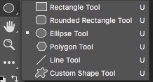
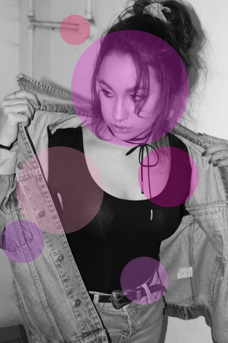
Here I have selected my ellipse tool to produce a circle.

Screen Shot 2017-05-22 at 12.43.37

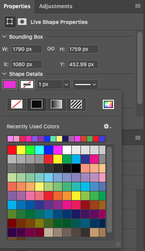
Underneath shape details, I have selected a pink colour.

Screen Shot 2017-05-22 at 12.43.52

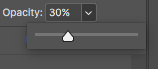
I have changed the opacity down to 30% to allow my circle to be quite transparent.

Screen Shot 2017-05-22 at 12.44.03

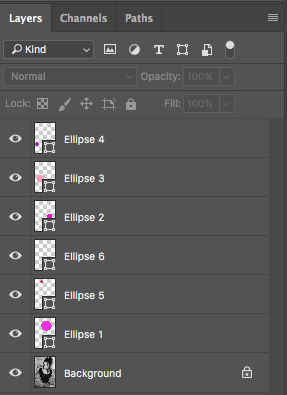
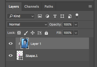
This screenshot shows that each coloured circle has a new layer.

Screen Shot 2017-05-22 at 12.49.14

I then flattened all my layers to produce my final image.
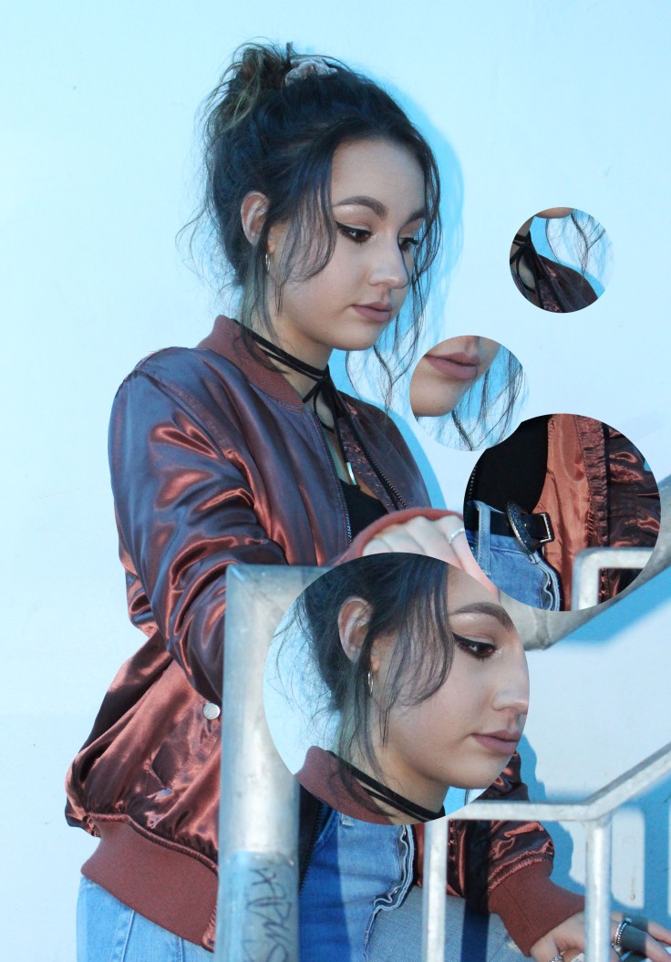
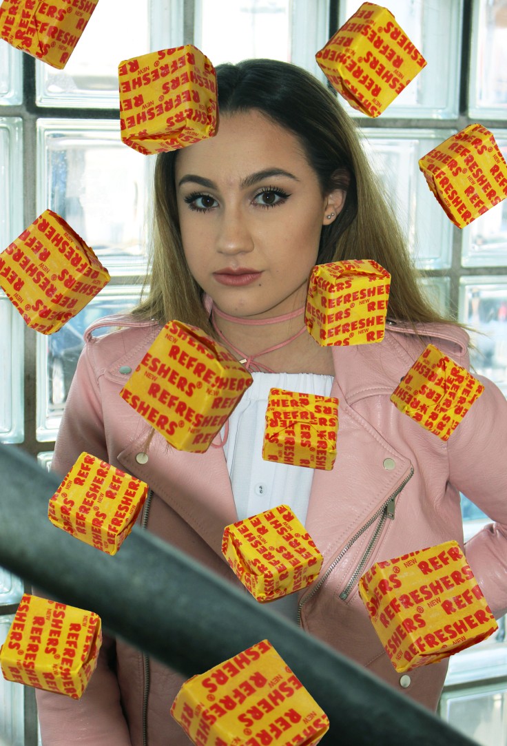
FINAL EDIT 1

EDIT2

SCREENSHOTS OF EDITING PROCESS

Screen Shot 2017-05-22 at 13.14.06

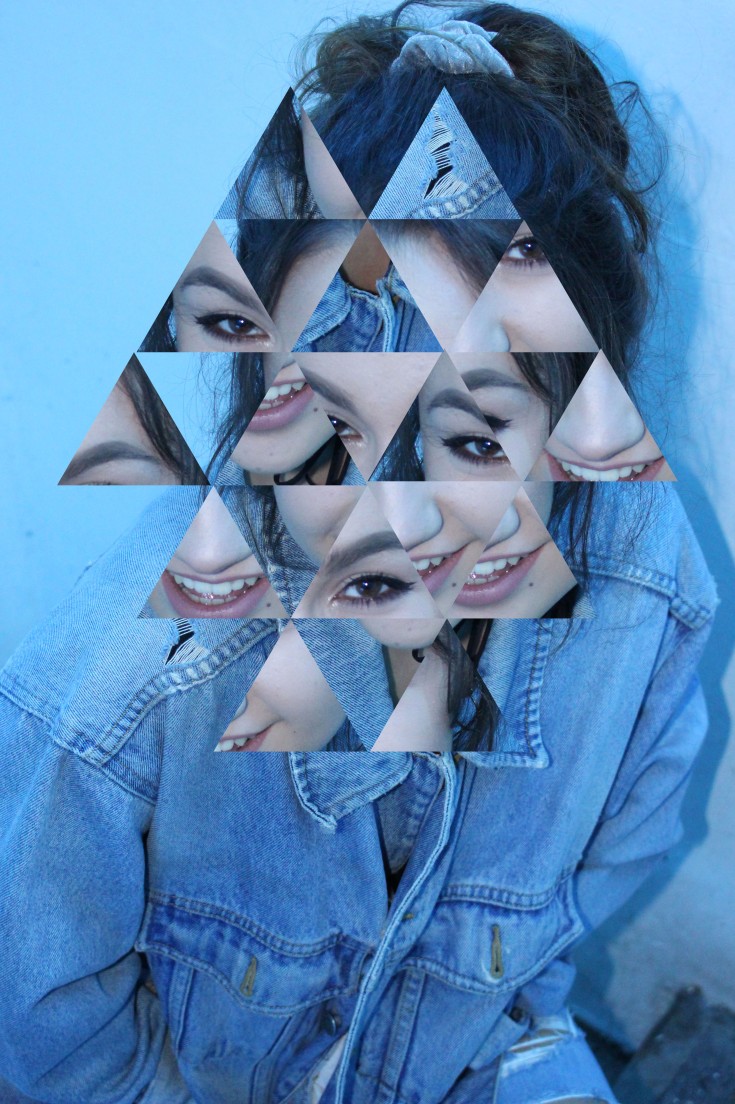
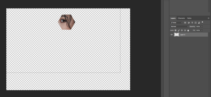
In order to get a triangle shape, I selected custom shape tool.

Screen Shot 2017-05-22 at 13.14.23

I then selected the ‘shape’ category and found a triangle.

Screen Shot 2017-05-22 at 13.15.22

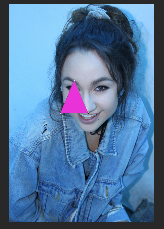
Here I have placed a triangle on top of my image of the size I wanted my cut outs to be.

Screen Shot 2017-05-22 at 13.16.00

Swap the two layers over so the background is now layer 1.

Screen Shot 2017-05-22 at 13.18.48

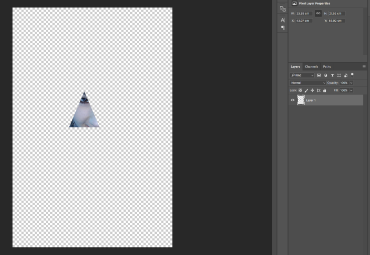
I then made a clipping mask on layer 1 but right clicking and selecting ‘clipper mask’. This allowed me to move my image underneath the triangle and select the different areas where I want my triangle to cut out. When my triangle was in the right place, I selected my both layers and pressed CmdE. This then allowed me to drag the cut out triangle where I wanted.

Screen Shot 2017-05-22 at 13.19.12

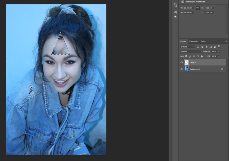
I then made sure I had the same image on another tab ready to drag my triangle cut outs onto and place where was needed and continued doing this.
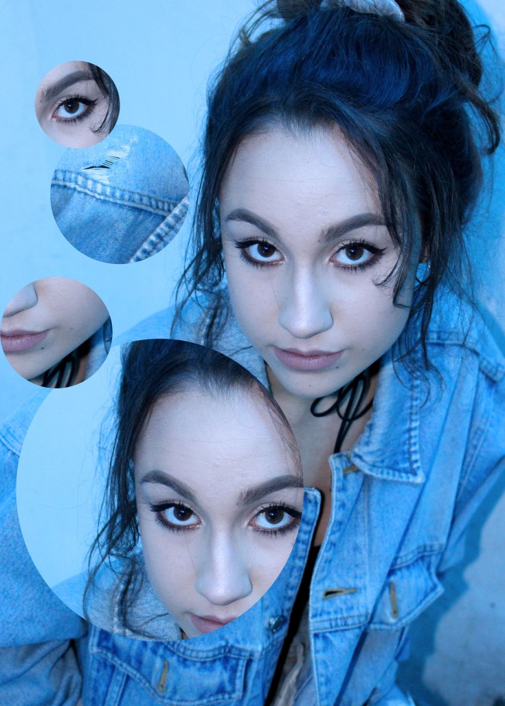
FINAL EDIT 2

EDIT1

SCREENSHOTS OF EDITING PROCESS

Screen Shot 2017-05-22 at 15.44.16

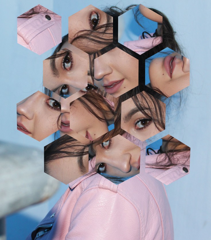
Similar to my other edit, however I selected a different shape tool and selected a hexagon. I did the same steps as my last image by pressing CmdE and dragging the cut out triangle to my other image.

Screen Shot 2017-05-22 at 15.44.30

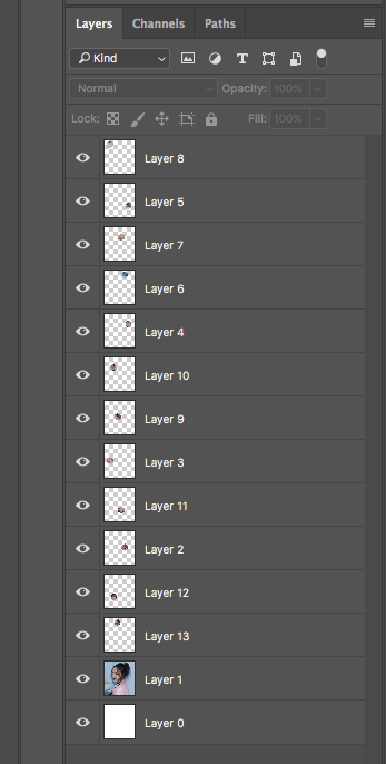
This screenshot shows how each hexagon had their own layer.

FINAL EDIT 3

EDIT3

EVALUATION

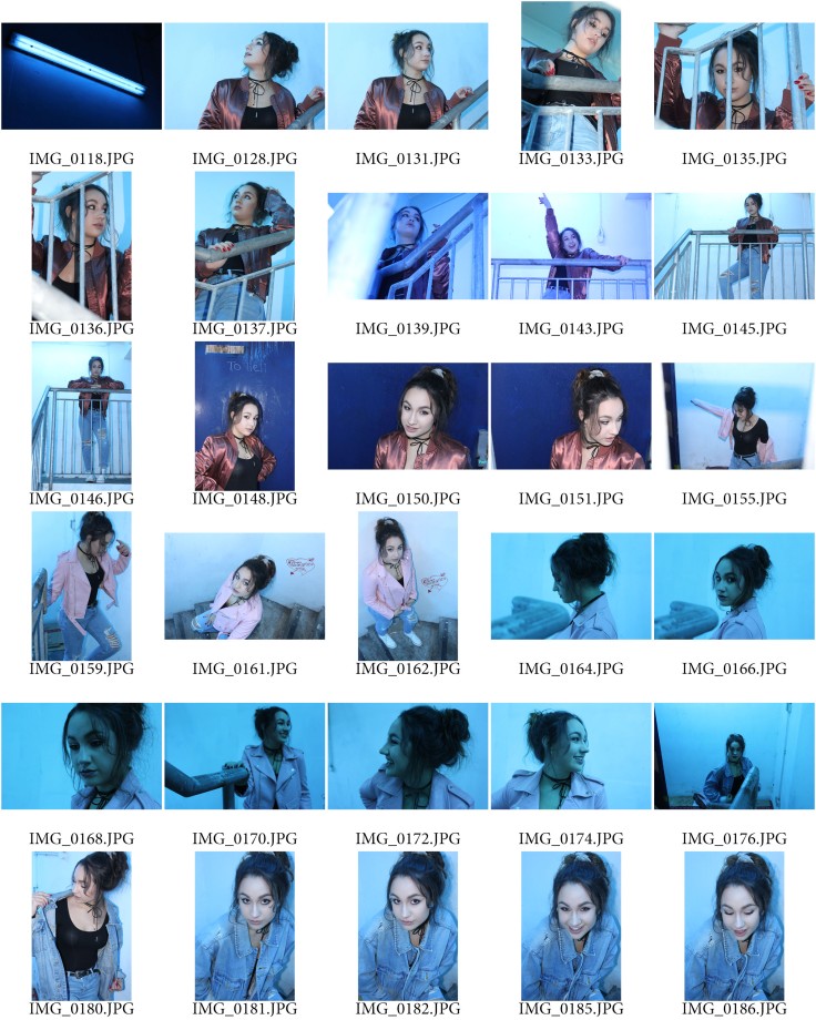
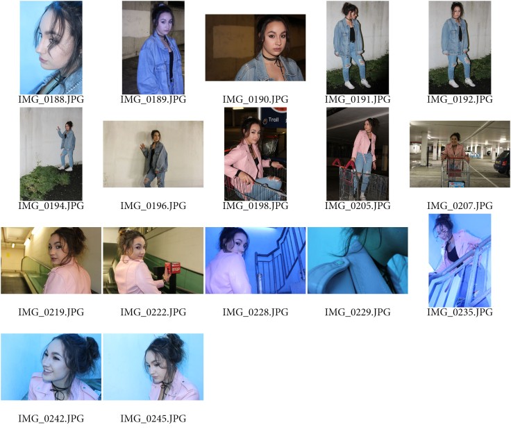
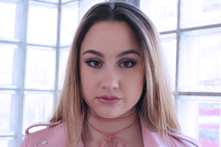
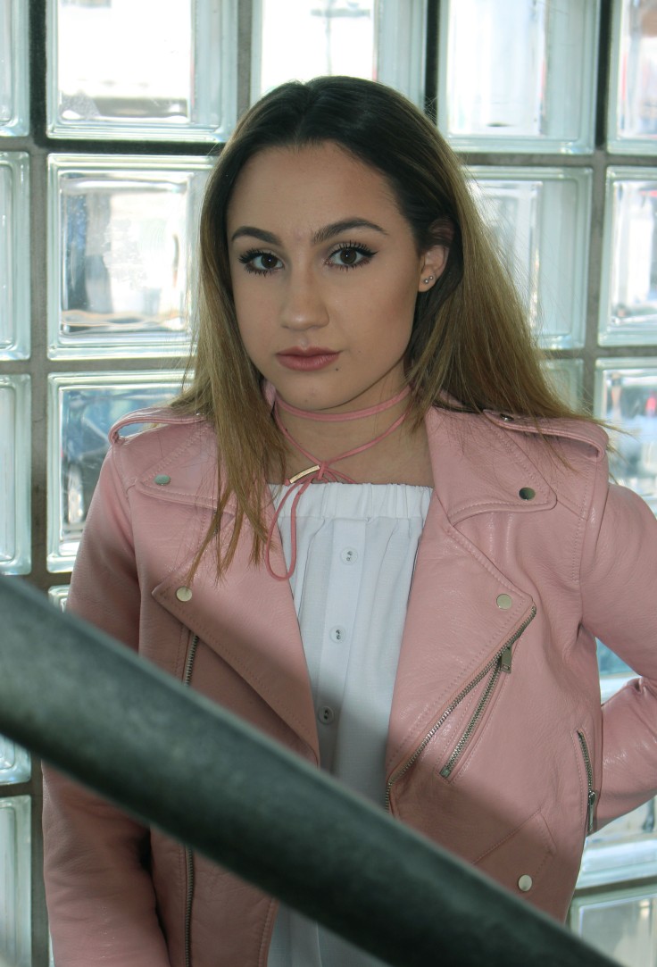
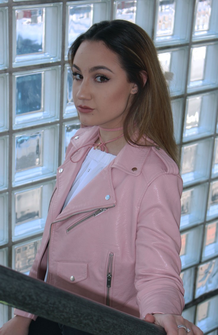
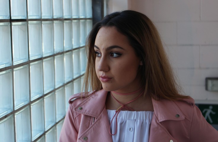
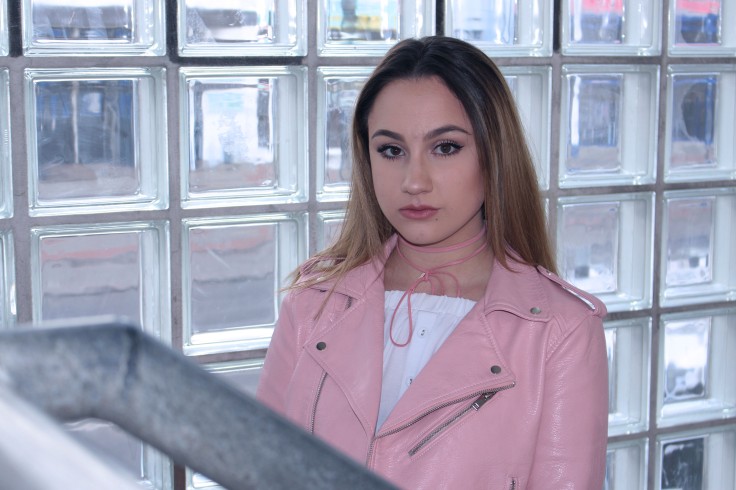
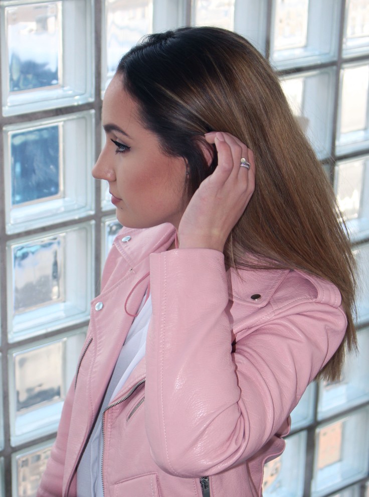
The purpose of this assignment was to be able to investigate and analyse the use of a range of digital image manipulation techniques. In order to achieve this I have taken four different shoots with my camera (cannon 700D) to experiment and practice with a photomontage theme. Throughout this project I experimented with different digital editing effects and one ‘physical manipulation’ experiment.

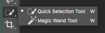
The different techniques that I have learnt and used across this project include photoshop skills such as the Quick Selection Tool. This tool works by clicking the Quick Selection tool from the toolbox and then left-click on the object you want to cut out. I have also experimented with the opacity tool and the custom shape tool to find different and more complicated shapes. I also learnt how to use a scanner for this project in order to scan my physical manipulations onto my computer to edit further in photoshop.

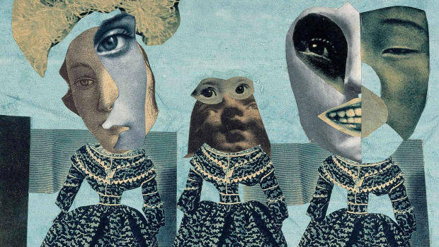
My initial idea for this project all stemmed from my mood board. This allowed me to narrow this project down using photomontage with shapes, people and layering. After creating my mood board it gave the right direction in what to shoot. I mainly shot portraits so I could edit people. I also did a studio still life shoot which I had never done before. Because I knew which direction in photomontage I wanted to experiment in, I was able to find two contemporary photomontage artists, Adam Hale and Julie Cockburn who I both really liked and connected with their work.

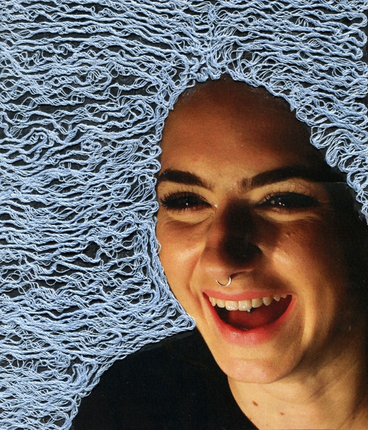
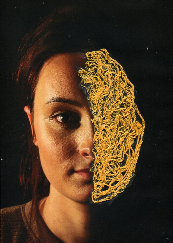
My final pieces are mostly inspired by the way Julie Cockburn’s work and the way her work is constructed. I was especially inspired by the way she edits her photomontages using shapes to layer on top of the same image. I then used this idea for my own work.

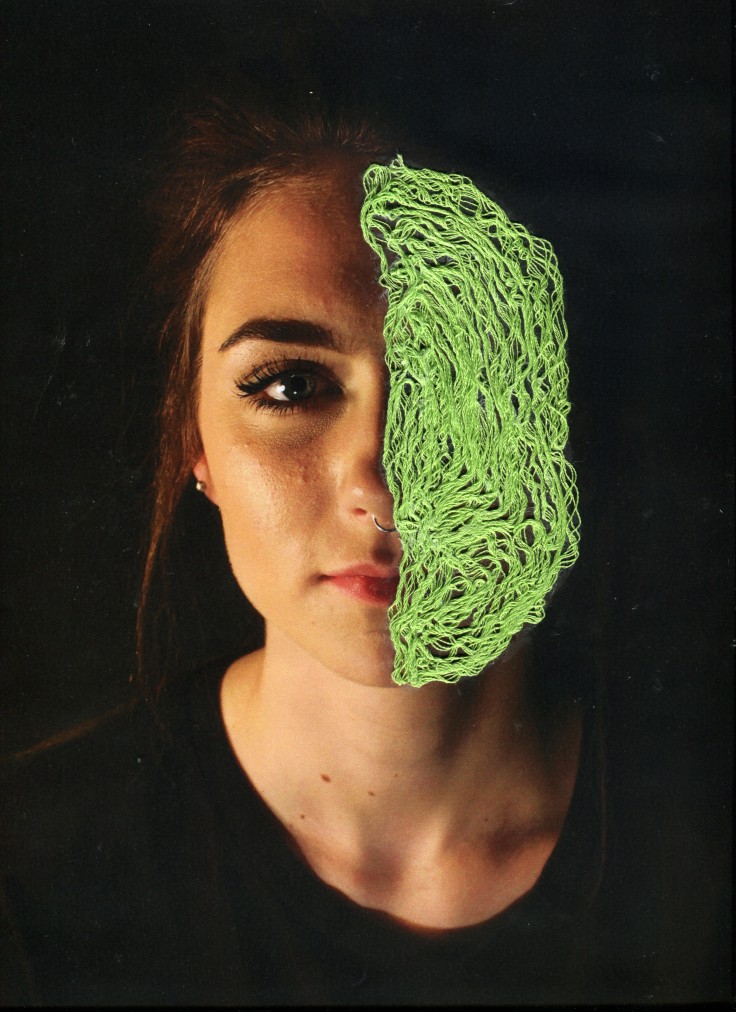
For my first edit, I experimented with the opacity density on photoshop which I had never used before. In order to create this look I had to change my image to black and white. I then chose to change all the pink circles to 30% opacity to allow enough of the image to shine through the circle however still keeping enough colour. I also chose the colour pink as I thought it personally suited my models personality and style, giving the image more depth. I enjoyed editing this image as it gives the viewer a fun feel and I learnt a new skill whilst doing so.

My second image was slightly more complicated as it required me to know some photoshop short cuts, such as knowing ‘CmdE’ to drag the cut out shape in order to layer my image. I learnt this independently by watching some youtube tutorials on photoshop and browsing the internet. I chose triangles to use as a geometric pattern as it is the same  shape Julie Cockburn mostly uses.

My last image was the hardest to achieve. This was because I chose a hexagon to use which took slightly longer to work with and position than the triangle. I chose the hexagon to challenge myself and put a personal twist on my work. I also decided to flip the hexagons around when positioning on my image. I really liked the look this created because it makes the image as a whole more muddled and confusing at first glance.

In conclusion, I am really happy with my final pieces as they came how I intended. However I think the last one where I layered hexagon cut outs stands out more than the others. The colour is quite saturated and vibrant which might contrite to its string appearance. I am pleased with how the other two turned out, but if I were to re-edit my first edit, I would of enhanced the contrast more to make it look less soft. Another reason why I think the third one is slightly better is because it looks marginally more complicated to produce.


THIRD SHOOT – PHYSICAL MANIPULATIONS

STUDIO PORTRAITURE CONTACT SHEETS

Camera settings:

  • ISO – 200
  • Shutter speed – 1/50
  • Aperture – F/5.6

LLLL

LLLLLLL

PHOTOSHOOT LIGHTING DIAGRAM

Screen Shot 2017-06-05 at 19.23.05

This is the layout of the studio when I took my shoot. However the backdrop was black instead of white but the website didn’t have a backdrop to show as part of the example. I used only one harsh light to achieve a split lighting technique on my models harsh. I didn’t need a background light for the background as I wanted it to remain dark.

FINAL EDITS

1 123

EVALUATION

I really enjoyed making this photomontages by hand. I was fun to experiment with using different medias within my photography. I chose to use bright and bold colours to contrast against the black backdrop I used for this shoot. I also feel this makes the image look dramatic to the viewer. However next time I will change the glue I used as I was disappointed that you can are able see the dried glue after scanning my images.

SECOND SHOOT – DIGITAL MANIPULATIONS

CONTACT SHEETS

Camera settings:

  • ISO – 3200
  • Shutter speed – 1/100
  • Aperture – F/5.6

ContactSheet-001ContactSheet-002

ContactSheet-002

SELECTED IMAGES

These are my best images from the shoot which I will then edit further.

This slideshow requires JavaScript.

THE PHOTOSHOP PROCESS

Screen Shot 2017-05-16 at 14.19.13

This is I created the different circles on photoshop by selecting the Elliptical Marquee Tool. I then copied and pasted the circle and moved it where I  thought looked right.

FINAL MANIPULATONS – JULIE COCKBURN INSPIRED

02O2

EVALUATION

As I don’t have much experience with using photoshop so I found creating these photomontages challenging however I enjoyed a learning a new skill on photoshop. I chose to do this shoot outside of the studio so I have a variety of photo shoots for this project. As I took this shoot in a Sainsbury’s car park stair way near to where I live in corydon, it was really hard to correct the white balance and I did mange convert it but I after comparing the images, I decided I quite liked the blue tones the images have. I feel the blueness gives it a kind of street style look which I’m a fan of. The first image the photo shot contact sheets show the colour of the lighting. I added this is to give more information about the shoot location and set up.

SHOOT 1 – DIGITAL LAYERING

PART ONE – PORTRAITURE SHOOT

Camera Settings:

  • ISO – 320
  • Shutter speed – 1/60
  • Aperture – F/5.6

ContactSheet-001ContactSheet-002ContactSheet-003

The highlighted images show were I had problems with the camera settings creating my images to be too exposed and under exposed.

EDITS

IMG_0422IMG_0362IMG_0370IMG_0382IMG_0347 copyIMG_0369


PART TWO – STILL LIFE SHOOT

I did this shoot in the studio using a white backdrop and a key light. These pictures I have taken will be used for to layer in photoshop to create a college in a photomontage style. I plan to take another shoot using a model which I will ayer these images over.

Camera settings:

  • ISO – 100
  • Shutter speed – 1/125
  • Aperture –  F/11.0

SWEETS1

SWEETS2

STUDIO LIGHTING SET UP

Screen Shot 2017-05-22 at 11.11.11

This is how I shot my still life photoshoot, in the screenshot above the flowers represent the sweets. I used a white background so I will find it easier when it comes to layering my images as I will get a cleaner cut around the sweets due to the contrast in colour.

THE PROCESS USING PHOTOSHOP

Screen Shot 2017-05-15 at 13.17.24

Here is the Quick Selection Tool. You can use the quick selection tool to quickly “paint” a selection using an adjustable round brush tip. As you drag, the selection expands outward and automatically finds and follows defined edges in the image.

Screen Shot 2017-05-15 at 13.17.37

When you drag your mouse over the part of your image that you want to cut out (in my case, the refresher sweet), make sure it is selected with the +.

Screen Shot 2017-05-15 at 13.17.48

After you have selected everything you wanted, make sure your quick selection tool is on -. This allows you backtrack your steps and help you tidy up the areas that need straightening.

FINAL EDITS

edit2edit3

These are my collages where I have merged my two shoots together using the quick selection tool on photoshop. My aim was to recreate a pop art effect. In order to do this I turned up the contract, saturation and slightly edited the hue. I am pleased with the outcomes however the first one is my favourite. This is because I really like the bold colour contrast and the unusal concept of raining sweets.

Blog at WordPress.com.

Up ↑